Example dashboards from our decomposition tools for long-term emissions scenarios
In the previous post, we announced our new Python package that helps modelers explore the key greenhouse gas emissions drivers in their scenarios. This post shows examples of visual dashboards that these tools allow you to create.
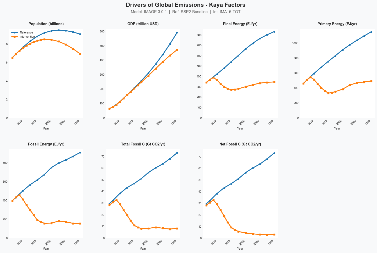
There are three main dashboards, as documented in Koomey et al. 2019 and Koomey et al. 2022. The first shows what we call "Kaya factors", like population, gross world product, final energy, primary energy, fossil fuel primary energy, total fossil carbon emissions, and net fossil carbon emissions after accounting for sequestration. We use runs from IMAGE 3.0.1. The baseline is SSP2 and the intervention case is IMA15-TOT, a scenario that keeps global temperatures from exceeding 1.5 C. The runs are documented in van Vuuren et al. 2018.
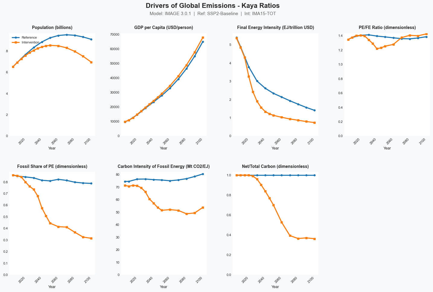
The second dashboard shows what we call the "Kaya ratios", which are the terms in the expanded Kaya identity. These include population, economic activity per person, final energy per dollar of economic activity, primary energy per unit of final energy, the fossil fuel fraction of primary energy, total fossil carbon per unit of primary energy, and the ratio of fossil carbon reaching the atmosphere to the fossil carbon combusted in the energy system.
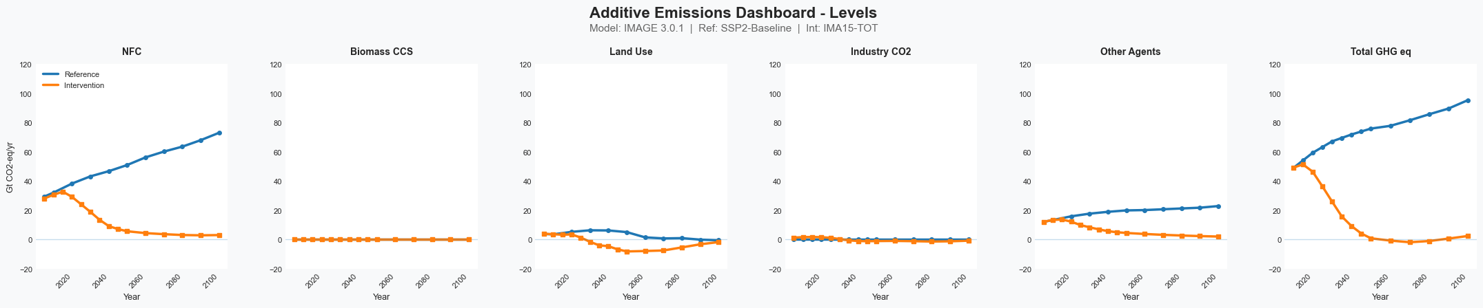
The third dashboard summarizes our "fully expanded decomposition", which includes the energy sector results in one pane, along with additive results for biomass CCS, land use, industrial process carbon dioxide emissions, and emissions of other gases than CO2 (other agents). The intervention scenario in this case has no biomass CCS and little change in industrial process emissions.
These dashboards together give a complete high-level picture of the evolution and emissions of the global economy for a business-as-usual scenario and an emissions reduction scenario. Of course it's always possible to dig deeper, but these three dashboards are a great place to start. We hope that automating the creation of such dashboards will enable much faster troubleshooting and high-level analysis of scenarios.
To view the notebook that explains how to make these graphs, go here.
To download the Excel workbook that contains the original data for the scenario pictured above, go here.
References
Koomey, Jonathan, Zachary Schmidt, Holmes Hummel, and John Weyant. 2019. "Inside the Black Box: Understanding Key Drivers of Global Emission Scenarios." Environmental Modeling and Software. vol. 111, no. 1. January. pp. 268-281. [https://www.sciencedirect.com/science/article/pii/S1364815218300793]
Koomey, Jonathan, Zachary Schmidt, Karl Hausker, and Dan Lashof. 2022. "Exploring the black box: Applying macro decomposition tools for scenario comparisons." Environmental Modeling and Software. vol. 155, September. [https://doi.org/10.1016/j.envsoft.2022.105426]
van Vuuren, Detlef P., Elke Stehfest, David E. H. J. Gernaat, Maarten van den Berg, David L. Bijl, Harmen Sytze de Boer, Vassilis Daioglou, Jonathan C. Doelman, Oreane Y. Edelenbosch, Mathijs Harmsen, Andries F. Hof, and Mariësse A. E. van Sluisveld. 2018. "Alternative pathways to the 1.5 °C target reduce the need for negative emission technologies." Nature Climate Change. 2018/04/13. [https://doi.org/10.1038/s41558-018-0119-8]
